
Grove read
The Surprising Story of Prussian Blue and Why It Disappeared From Modern Acrylic Paint
Prussian Blue, known scientifically as pigment PB27, is a deep and intense shade that left a massive mark on art history. This particular color defined the melancholy mood of Picasso during his famous Blue Period and served as a staple for painters throughout the Baroque and Rococo eras. It is also the very pigment generated during the cyanotype printing process, which gave rise to the everyday term blueprint. Despite its widespread historical importance across multiple artistic mediums, modern artists who prefer working with acrylics will find it incredibly difficult to locate a tube of genuine Prussian Blue on store shelves today.
Brian Clark
Margin note
Reading tip
The full digest continues below among botanical margin notes.
Grove
Olive Digests
Prussian Blue, known scientifically as pigment PB27, is a deep and intense shade that left a massive mark on art history. This particular color defined the melancholy mood of Picasso during his famous Blue Period and served as a staple for painters throughout the Baroque and Rococo eras. It is also the very pigment generated during the cyanotype printing process, which gave rise to the everyday term blueprint. Despite its widespread historical importance across multiple artistic mediums, modern artists who prefer working with acrylics will find it incredibly difficult to locate a tube of genuine Prussian Blue on store shelves today.
An Accidental Invention Born From Contaminated Blood
The discovery of Prussian Blue happened entirely by chance in Berlin around the year 1704. According to historical accounts written by a German physician named Georg Ernst Stahl, a pigment manufacturer named Diesbach was attempting to produce a batch of traditional red pigment. His recipe required potash, crushed insects, and iron sulfate. When he ran out of potash, he purchased a replacement batch from a local alchemist and pharmacist named Johann Konrad Dippel. Unbeknownst to the maker, this specific batch of potash had been contaminated with dried animal blood. When mixed together, the chemical reaction unexpectedly produced a deep, rich blue instead of the intended red.
Recognizing the financial potential of this error, they experimented further and began selling the dark blue under the name Berlin Blue. The creators kept their formula a strict secret for two decades until a British chemist successfully deduced the chemical recipe in 1724 and shared it with the public. With his secret compromised, Dippel moved away and later attempted to trade a fake life-extending potion for a castle. His strange reputation led to rumors of grave-robbing and medical experiments, leading some historians to believe he inspired the story of Frankenstein. This accident marked the creation of the first synthetic blue pigment since ancient Egyptian times, predating other modern blues by more than a hundred years.
Shifting Tones in Traditional Japanese Woodblock Prints
While painters in Europe quickly embraced the new pigment, artists in Japan utilized its unique qualities to its full potential. During the nineteenth century, the pigment became a central element in a specific style of woodblock printing known as aizuri-e, where pictures were created almost entirely in shades of blue. Previously, printmakers relied on natural indigo ink, but the newly imported blue proved to be far richer and more resistant to fading over time.
The true strength of this pigment lies in its incredible tonal flexibility, allowing a single ink to display an extensive range of values. The legendary artist Katsushika Hokusai relied heavily on this chemical color to create his iconic landscape series depicting views of Mount Fuji. When applied in thin, diluted layers, the ink produced delicate, transparent washes that perfectly captured the look of misty, distant horizons. At the same time, heavy applications could create deep, dark areas that appeared almost completely black. This wide range allowed printmakers to build remarkable depth and atmosphere using just one base pigment.
The Chemical Conflict Preventing Its Use in Acrylic Paints
Today, this historical pigment is still widely available in oil paints, watercolors, and printmaking inks, continuing its long legacy. However, finding a genuine version in an acrylic formulation is exceptionally rare. The reason for this absence comes down to basic chemistry and the sensitivity of the pigment to alkaline substances. The chemical structure of the blue pigment requires a binding medium that is neutral or slightly acidic, maintaining a pH level of seven or lower.
Traditional binders like linseed oil used in oil paints or gum arabic used in watercolors fit this requirement perfectly. In contrast, the liquid polymer emulsion used to create acrylic paint is naturally alkaline. When the genuine pigment comes into contact with this basic environment, it chemically breaks down and loses its color. To overcome this limitation, paint manufacturers create alternative mixtures to mimic the shade. They blend stable alternatives like phthalo blue with black, violet, or green pigments to replicate the deep, moody appearance of the original historical color without the risk of chemical degradation.

The Debate Surrounding the Longevity of the Pigment
Even when used with compatible binders like oil or watercolor, the pigment has historically carried a reputation for instability. Shortly after its invention, artists noticed that the color could fade when exposed to bright sunlight or when mixed with certain chemical bases. Because manufacturing standards varied wildly over the centuries, the quality was often unreliable. When highly stable synthetic blue pigments emerged in the mid-twentieth century, many artists gladly switched to these newer options for their guaranteed lightfastness. While the newer alternatives offer a similar green undertone and intense tinting power, they tend to look much brighter and lack the characteristic moodiness of the original formulation.
Although modern chemical manufacturing has significantly improved the particle consistency and longevity of the historical blue, its performance remains somewhat unpredictable. Standard laboratory tests often label it as highly durable, but real-world artistic applications tell a different story. When thin washes or light tints are used, the color is much more susceptible to fading. This vulnerability is especially true when the pigment is blended with white paint, as the white particles reflect more light throughout the paint layer and accelerate the fading process. Remarkably, the color possesses a unique ability to regenerate. If a painting containing this faded pigment is stored temporarily in a dark, well-ventilated room, the color gradually restores itself. Because of this phenomenon, some art museums regularly rotate their historical collections to give the artworks a chance to recover.
The Surprising Versatility of Color Blends
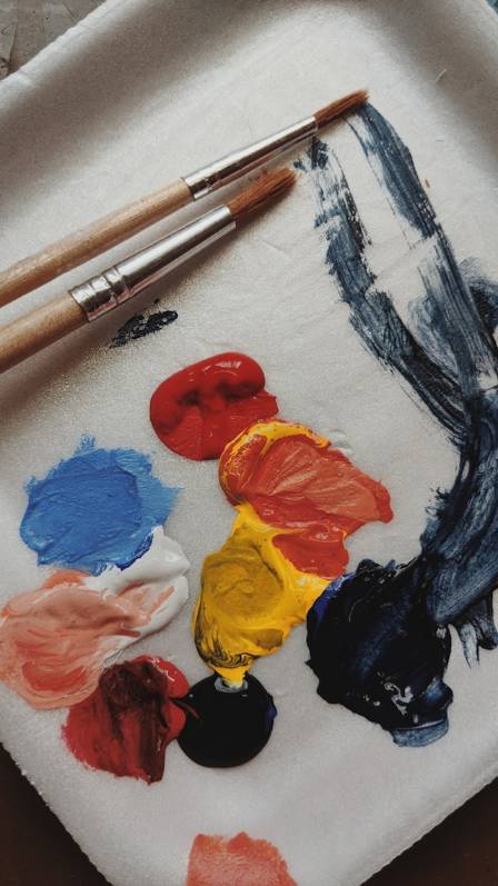
Despite its historical quirks, the pigment remains an incredibly powerful tool for artists when blending colors on a palette. When mixed with a bright lemon yellow, the blue reacts to create incredibly vibrant, almost fluorescent shades of green that feel artificial and electronic. However, when blended with an earthy yellow like nickel azo, it yields a beautifully warm spectrum of golden, autumnal greens that fit perfectly into natural landscape paintings. Due to its strong greenish undertone, the pigment also interacts beautifully with deep reds. Combining it with a rich iron oxide red creates a deep, complex chromatic black. This mixture provides a wonderful alternative for artists who prefer to avoid using pre-made black pigments, offering a more lively and dynamic dark tone for shadows and deep space.
More along this branch
LEAF · en
What are the characteristics of the latest plum blossom
Plum blossom refers to a flowering tree belonging to the genus Prunus in the Rosaceae family. In some contexts, the term may also describe the fruit (plum) or the flower itself (plum blossom). It typically blooms during late winter and early spring and is traditionally recognized as one of the “Four Gentlemen” alongside orchid, bamboo, and chrysanthemum.
LEAF · en

The Most Popular Cocktails for the Summer of 2025: Refreshing Drinks to Sip in the Sun
Summer 2025 has arrived, painting the world in golden light, warm breezes, and the promise of unforgettable moments—whether that’s a backyard barbecue with friends, a lazy afternoon by the pool, a beachside sunset picnic, or a rooftop gathering as the sky turns pink. And what elevates these moments better than a perfectly crafted cocktail? This season, the mixology scene is all about balance: light yet flavorful, refreshing yet memorable, with a nod to both timeless classics and innovative new creations. At Cocktails and Shots, we’ve curated the definitive list of the most popular cocktails for Summer 2025, blending fruity brightness, herbal freshness, bubbly effervescence, and even savory twists to suit every palate. From low-ABV sips to non-alcoholic delights, from tropical escapes to sophisticated pick-me-ups, these drinks are designed to keep you cool, energized, and in the summer spirit. Below, we dive into each cocktail’s story, step-by-step recipe, pro tips, and why it’s blowing up this year—so you can impress guests, treat yourself, and sip your way through the season in style.
LEAF · en

Top 3 Infamous Counterfeit Cases in the World of Art
The history of art forgery stretches back to ancient times, with instances like the Romans replicating Greek sculptures and ancient China producing a plethora of deceptive works. Modern art, too, hasn't been spared from the onslaught of fakes. While some forgeries are innocently crafted by enthusiastic students imitating masters, others are meticulously designed to deceive unsuspecting collectors and enthusiasts. The proficiency of certain forgers has blurred the lines between genuine and counterfeit, leading to museums and investors inadvertently investing millions in inauthentic pieces.
LEAF · en

How to Play Rugby for Beginners: A Comprehensive Step-by-Step Guide
Rugby is more than just a sport—it’s a global phenomenon that blends raw athleticism, strategic thinking, and unbreakable teamwork. Loved by millions across continents, from the grassroots pitches of Argentina to the professional stadiums of England, it offers an adrenaline-fueled experience that rewards dedication and camaraderie. For beginners, the sport may seem intimidating at first—with its unique rules, physicality, and array of positions—but breaking it down into fundamentals makes it accessible to anyone willing to learn. Whether you’re drawn to the intensity of a scrum, the excitement of a try, or the bond of playing alongside teammates, this guide will walk you through everything you need to know to step onto the field with confidence. From understanding the core rules to mastering essential skills and choosing the right gear, we’ll turn complexity into clarity, helping you embark on your rugby journey with enthusiasm and purpose.
LEAF · en

Top 10 Reasons to Embark on a Mediterranean Adventure
The mere mention of the Mediterranean conjures images of tantalizing seafood, sun-drenched beaches, and charming piazzas with dancing fountains. The Mediterranean Sea, nestled between Europe, Africa, and Asia, boasts a dazzling array of landscapes along its shores, each weaving its unique charm into the rich tapestry of the Mediterranean region. Here are the top 10 reasons why a journey to the Mediterranean is an absolute must:
LEAF · en

A Comprehensive Guide to Selecting Women’s Underlayers: Enhancing Every Silhouette
Choosing the ideal underlayer—be it a delicate camisole, a fitted bodysuit, or a light knit—is a foundational step in building a sophisticated wardrobe. These essential pieces do more than provide comfort; they serve as the structural base for your entire outfit, influencing how your silhouette appears and how your outer layers drape. By understanding your specific body type, you can select underlayers that accentuate your best features and provide a seamless, confident look for any occasion.